Thursday, 10 December 2009
4.How did you use new media technologies in the construction and research, planning and evaluation stages?
3.What have you learnt from your audience feedback?
We were told that the digipak has a good design and it was a good effect that the black and white effect with one colour has been kept throughout the project. We have been told that we could improve our digipak by changing the back cover so it is more interesting, and we could have considered the editing of the photographs more. The positives of our magazine advert were that it links strongly with the digipak well, the use of the artwork went well, and the fonts and images were successful. However we were told that we could improve on this by having more effects on the images, the images should bled more with the rest of the advert and the photograph could have had more time spent on it.
2.2.How effective is the combination of your main product and ancillary texts?
1.In what ways does your media product use, develop or challenge forms and conventions of real media products?
“ 2. There is a relationship between lyrics and visuals (either illustrative, amplifying, contradicting)” Andrew Goodwin writing in ‘Dancing in the Distraction Factory’ (Routledge 1992).
The camera angles which were used in our video, that I felt effective were; the long shot when the girl is standing halfway up the grassy hill
singing and dancing, whilst the boy is standing at the top of the hill. There was also a shot where the performer of our music video walks up the street singing the song, then when she reaches the word `edge` she puts her hand over the camera revealing herself wearing a new outfit which is the red jacket, the main focus of the effects in our video.
The lighting in our video was very light and bright at the start of the video, and it gradually got darker as the video continued. After filming the footage we watched it back and realised that it was too dark, and we could hardly make out the words which our performer was singing, so using the effects such as contrast and brightness on final cut, we edited this so that we could see her, and what she was singing. I also feel that at the end of the video the lighting was used effectively, as the final scene is where the girl and boy meet at the hilltop, with the background looking like a sunset I feel that this was effective because it symbolises that it is the end of their `glorious day` and the end of the song.
The mise-en – scene in our video was used to create the effect of our black and white with one colour, which was used the red jacket for as the one colour. The black and white effect choice came from watching pinks video to `I don’t believe you` (2009), as this video was all in black and white, the song that went with it was quite sombre, and quite different to the song that we chose, we did feel that this effect in our video may work well, even though it is a relatively up beat song. Another music video which influenced our music video was that of Bob Dylan’s `Subterranean Homesick Blues` 1965, in this video it shows a man standing in one spot holding up a series of cards with the song lyrics written on, we thought that this was a very original idea for a music video, after watching this video we felt that it might work if our performer held up cards with the lyrics of the song written on and threw them behind her as she walked. As we felt that having lots of song words written on cards would be uneffective and look unprofessional, so we thought we would try out only having 4 cards with occupations written on for the female performer to throw, and 3 cards for the male performer to throw backwards and we feel that this worked well.The black and white with one colour effect idea partly came from the video to Black eyed peas `meet me halfway` 2009, as in part of this video there is a man with everything in something similar to just black and white with his red collar standing out, and we felt this looked effective. Our digipak design relates to the digipak design of oasis, we liked the 6-panel effect, so we decided to use this. Another thing we liked about this digipak was the colour design they used, which was a beige coloured theme, and how, throughout their digipak they kept the same consistency all along with the colours.
Wednesday, 2 December 2009
Plan for filming
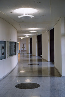
We are going to be filming our documentary type footage tomorrow which is going to involve Natasha talking to the camera for approximately 2-3 minutes about our project.
We are hoping to be able to find somewhere quiet to do this so that we can try not to have too many noises etc. disrupting our footage.
Places that we were thinking of were
- A small office somewhere around college
- An empty classroom
- A quiet corridor
We will be filming during lesson time, by doing so we are hoping to avoid having too many people walking past wherever we decide to film.
Tuesday, 1 December 2009
Documentary
- In what ways does your media product use, develop or challenge forms and conventions of real media products?
- How effective is the combination of your main product and ancilliary texts?
4. How did you use new media technologies in the construction and research, planning and evaluation stages?
We will not be filming these questions however! we will be writing the answers to the questions in the lesson , we will then be filming on thursday December 3rd.
We will be storyboarding how our documentary is going to be filmed, how the timeline is going to go.
Thursday, 26 November 2009
Digipak
We also had to create a digipak, for this we decided to stick with the black and white with the one colour(red) theme, we stuck with this with the background and the writing as well.
We feel that this looks effective and works well.
Magazine Advert
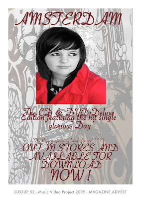
As part of our task we had to create an advert for a magazine, advertising our band and the album that is being released
This is the final product,
having more time we would have made a few more changes, we may have added a few more photographs to it and in turn that may have made it more effective.
Wednesday, 25 November 2009
Magazine cover
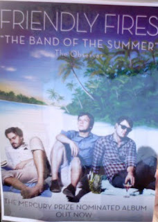
And we feel that for our advert we would like to have a photograph on the background, followed by a picture of the band, or in this case the artist in the foreground with the writing at the top of the advert.
Also, with the idea taken from this advert, we like the quote underneath the band title , so we feel that we may use this when creating our magazine advert.
Covers
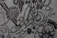
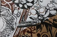
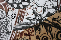
 After taking photographs of the artwork we were not sure how they would turn out, but after uploading them to photoshop we feel that they were a success.
Monday, 23 November 2009
Digipaks
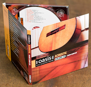
We have been looking on the internet for examples of digipaks and here are a few that we liked.
This is one by 'Oasis' that we liked as we feel that it has a nice colour scheme and the pictures and general design fits well to the music.
We found
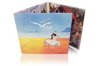 a 6 panel digipak which we liked the idea of because it gives oppertunity to put more information and more pictures into the digipak.
Thursday, 19 November 2009
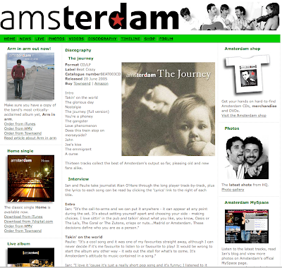
For our Digipack we need to either create a track list or find Amsterdam's track list. We choose to find Amsterdam's track list and use this. We found out that the album which the song we done our music video on 'Glorious day' is called 'The Journey'. On this album there are 13 tracks these are:
1. Intro
2. Takin' on the world
3. Glorious day
4. Nostalgia
5. The Journey (Full version)
6. You're a phoney
7. The gangster
8. Love phenomenon
9. Does this train stop on merseyside?
10. John
11. Joe's kiss
12. The emmigrant
13. A curse
We will use this track list on the back of our Digipack.
Wednesday, 18 November 2009
Music Video

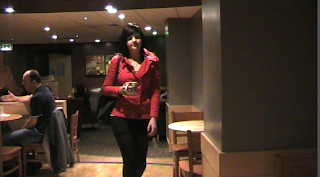
- the girl walking down a street was too boring and unentertaining.
- the girl walking around starbucks was too sterotypical
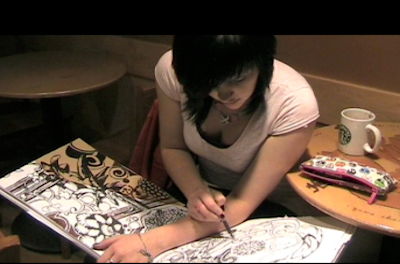
these were helpful as we fimed some more footage of our performer walking around an art gallery drawing some of the pieces of art, we feel that this was more effective as it was more entertaining that a girl just walking down a street, and it showed that our performer was not a sterotypical student , or a stereotypical teenager.
Tuesday, 17 November 2009
GROUP 52 FINISHED MUSIC VIDEO
Q3-52 MUSIC VIDEO 2009 from SATMEDIASTUDIES on Vimeo.
Monday, 16 November 2009
Finishing the project
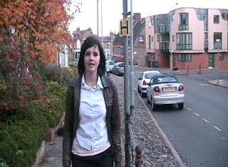
We have now finished the video part of the project, we feel that overall it was successful even thought it was very different to our original idea and we did not use much of the original footage which we filmed.
Our original ideas consisted of the girl , Emily , walking up a hill and singing the lyrics to the song. After filming this footage we were advised that this may be uninteresting to the viewer, so we then filmed some more footage of the girl walking around Cambridge, which involved her walking around shops, and going to get a cup of coffee.
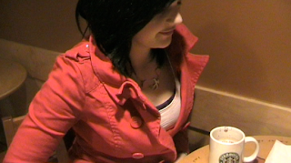
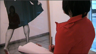
After filming this footage we thought that, this also would not keep the viewer entertained so we went to kettles yard gallery and filmed her drawing the pieces of art into a sketchbook. We felt that this was effective and worked well in contrast to the other footage. Another advantage of filming at the gallery is that it shows what the girl does in her spare time, which is different to the sterotpyical teenage life of getting a coffee in 'starbucks' as the previous footage had implied.
Finishing Effects
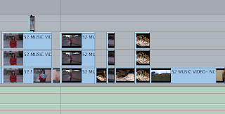
When editting our final footage, we decided not to change all of the footage into black and white. We decided only to change the footage where Emily is walking on the road into black and white, this is because we feel that if we change the whole project into black and white with one colour, it will reduce the effectiveness.
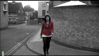 Instead of doing the effect for each individual clip, we did the whole process for one clip, and we then clicked on the clip, then clicked copy, and clicked onto the new clip where we wanted the effect to be and clicked Paste attributes.
Wednesday, 11 November 2009
Effects
- Clicked on the piece of footage which we wanted to lighten
- clicked on effects(at the top)
- clicked on video filters
- clicked on 'colour correction'
- clicked on 'colour corrector'
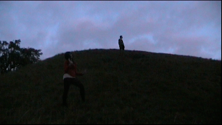
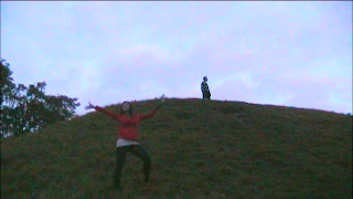
to
We feel that this has been successful and it works much better than the left hand side screen grab, we will be putting this effect on the rest of the clips which are this dark.
Monday, 9 November 2009
Review Of Kettles Yard Footage
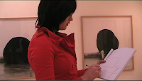
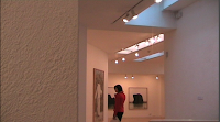
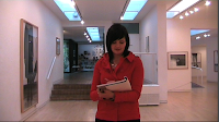
Today we watched back the footage which we filmed Friday 6th November for the first time. Our opinions on the footage which we captured is that there are good points and bad points.
A positive point is that there was good lighting in the gallery which we went to, this helped in our video as lighting is a problem which we have had in the past ( the light at the end of our video being too dark).
A negative point however, is that there is too many clips which are too similar to eachother, such as in these three screen grabs, although very different they are also quite similar.
We feel though, that the footage which we captured on Friday November 6th was successful, fits in well with the rest of the video , and looks much better than the previous footage which we had.(as shown below)
Sunday, 8 November 2009
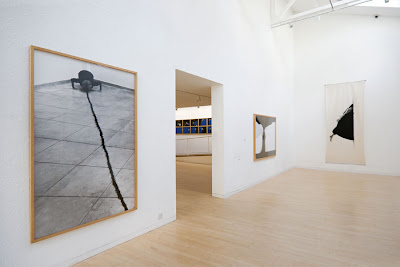
Kettles Yard Filming
Thursday, 5 November 2009
Filming
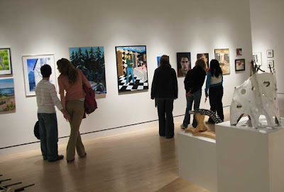
By filming at this place, we are hoping to capture Emily drawing some of the art pieces around the gallery, this is to show that she does something else outside of the stereotypical student life( getting a coffee from Starbucks etc.). This also adds another element to the music video, which is something different to her just walking around.. we feel as though this adds an `artistic` element to the video.
Editing
Things that are going well:
1.We have managed to get Emily's lips moving in time to the song lyrics. This is important as it makes it more believable to the audience that Emily is singing the words. At times this was difficult and took alot of time however once we got the hang of it we found it easier. Havi
 ng the background track from filming also helped to make lip syncing alot easier.
2. Near the beginning of the song "were crazy" is sung. During this part Emily is walking along a street. At this specific part she looks to her right hand side and her eyes looks to her right hand side. We feel this is effective as it shows she has a bit of craziness about her.
1. In the chorus Emily is walking along a street singing. Everything is in black
 and white except her jacket. This was effect was put on through editing. However the red is also on Emily's lips. This is something we need to try and change.
Wednesday, 4 November 2009
Editting Time
We felt as though we need some extra time, outside of lessons to finish editting our project.
The times that we are going to dedicate to our project is today, November 4th from 12.25-
If this is not enough time for editing we will be editting tuesday evening from 4.10-8pm.These extra sessions will be as well as our three weekly lessons. We are hoping that this will be enough time for us to edit our video.
Tuesday, 3 November 2009
filming problems

Filming.. Again!
Monday, 2 November 2009
Feedback
The overall view from the group is that we could improve by;
- Having a variety of shots
- Make the transitions sharper
- Make the shots less shakey
- Make it less dark at the end

- The variety of shots
- 'The beginning'
- Give the other character something to do or not include him
- Cutaways
- More editting
- More Performance
- Re-do with strong light
The strengths of our music video were;
- Lipsynching is good
- Good effects
- Good use of locations
- Original
- Performer did a good job
- Black& White and One colour looks good.
We are pleased with the feedback from the group, and we will be trying to improve on the negative points that have been brought up about our roughcut video.Although on some of the points it is quite difficult to do so, for example with the points about it being dark towards the end it is hard to find a time where we can all film and it is still light as the clocks have been put back now so it gets darker earlier, and we finish college at 4.10pm.
However we will try to film in any frees that we have.
Sunday, 25 October 2009
What Needs To Be Done?
We feel that there are some parts of the video where our performer looks convincing, but there are some bits where unfortunately, she either forgets the words or does not look convincing. So, to fix this we are hoping to re-film these parts, most of these scenes are highlighted in our blog post " Unsuccessful shots".
A problem that we had whilst filming, which could also occur again if we re-film parts, and lose track of time is that it got dark quickly, and due to the fact that we were busy filming, we did not notice how dark it had got until we watched over our footage again. We can try to avoid this by going to our location earlier, thereore catching more daylight in our shots, and less darkness.
The problems we could have with this though is being able to find a day/ time that all of us( group & performers) are free to film, due to having very different college timetables.We are going to film most of Emily`s parts either on a Monday(when we finish college at 3.25) or a Thursday morning, when the earliest one of us starts college is 10.50am. Unfortunately Tom can not make these times so we will have to film at the same time we did last time, but due to Tom only having a small part in our video we will be able to get his filming done on a Friday afternoon at around 4.30pm-5.00pm.
This week is half term, so we will not be able to film this week, we will however, be able to film the week afterwards, on Monday 2nd and Friday 6th November.
Thursday, 22 October 2009
ROUGHCUT MUSIC VIDEO
GROUP 52 Music Video 2009 ROUGHCUT(H.264) from SATMEDIASTUDIES on Vimeo.
Mp4 Quality:
GROUP 52 Music Video 2009 ROUGHCUT from SATMEDIASTUDIES on Vimeo.
Blog
We hope to be able to keep up this standard in both the blogs, and the video.
Although it has seemed difficult at times, we now feel as though it is paying off!
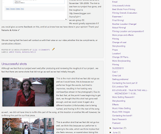
This was a quick overview of our blog, and the blog posts that we have done.
as we wanted to know what they thought about our blog! We also wanted to know what they thought about the final project!
Here is the e-mail that we sent to them
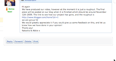 " Hi again , we have produced our video, however at the moment it is just a roughcut. The final piece will be posted on our blog when it is finished which should be around November 12th 2009. The link to see how our project has gone, and the roughcut is http://www.blogger.com/home?pli=1
we are group 52.
We would greatly appreciate it if you could give us some feedback on this, and let us know how we have done in your opinion! Thank you! Natasha & Abbie x"
We are hoping that the band will contact us with their view on our video,whether this be compliments, or constructive criticism.
Unsuccessful shots
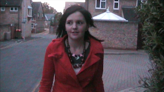 This is the main shot that we feel did not go as well as it could have, this is because our performer forgot the words, but tried to improvise, resulting in her looking very confused!(as shown in the photograph). Due to the fact that, at this point it was beginning to get dark, we thought that this shot had gone well enough, and we could cover it again at a different location.Unfortunately due to being rushed, and having to fit in the rest of the song as well , we did not have time to re-film this part of the song, at this location or another.We will however, be re-filming this part for our final piece.
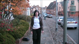
This is another shot that we feel did not go too well, we think this because our performer is looking to the side, which we think implies that she feels nervous, or scared about doing this video for us. We will be re-filming this bit, so that our performer does not look as awkward as she does in this shot.
Best Shots From Filming
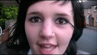
We like this shot as it is close to her face, and you can see her mouth clearly moving to the lyrics, we feel this is effective because it is necessary for the audience to believe that the performer is singing the song , and in time to the track.
We also like this shot as shortly after this she puts her hand across the camera on the word 'edge',wearing work clothes, then pulls her hand away, reappearing wearing a red jacket, and a dress(trying to show that she is getting ready for the weekend to begin, and for work to end).Although we had to film these shots over about 20 minutes, the way that we have editted them to fit together it looks as though we have filmed it straight away.
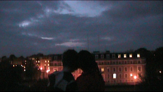 We also really liked this shot, this is the ending to our video whereby the two performers are standing at the top of the hill, close together with the building in the background brightly lit up and at the very end of the video the camera moves up pointing at the sky.We feel that this is effective because the song is called 'Glorious Day', and we feel that it is showing that she has had a brilliant day, everything has turned out the way she has planned, and that now(in this shot) it is the end of her 'Glorious Day, but a very good ending :)
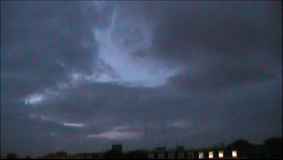
This was the final shot of the video !
Wednesday, 21 October 2009
Effects-Sin City Effect
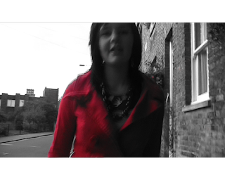
To create this black and white effect with colour, on final cut we chose a clip , and selected it, we then copied it , making two of the same clip. The first clip was then made into black and white, using the black and white effect. The second clip, we clicked on the chroma key effect button, chose the colour, (which in this case was red as this was the colour of the coat).
It then needed to be adjusted to mask the whole item that was going to be in the one colour(the coat). We then had to select revert. As we couldn't do this all in one clip, we had to do this in two seperate clips, clip 2 was the left side of the coat, and clip 3 was the right side of the coat.
Tuesday, 20 October 2009
Filming Overall..Evaluation
Definitely, when we first heard the song we thought that we could come up with a good video for it, we hope that we have done that! We also really like the song as we feel it has a good upbeat rhythm to it, although some of the words do seem a bit strange!
What did we find difficult?
Due to having a particularly small group, we found it difficult to initially come up with ideas, but once we put our minds to it we came up with what we feel were some good ideas. Also, due to having a small group it was very hard to go out filming as we had many jobs that needed doing at once, such as; filming, controlling the camera,taking photographs for the blog,and directing. Because of these problems we found ourselves taking on more than one job, but this wasn`t too bad!
What have we particularly enjoyed about this project?
We feel that this project overall has been really fun to do, and has been very interesting, we have learnt techniques for filming, for using the camera, and we have picked up some techniques for editting. We have really enjoyed it and feel it has been very interesting.
Saturday, 17 October 2009
Expenses !
£4.00
to put into the C.D. player which we took with us, as the C.D. player needed 6 of these.


