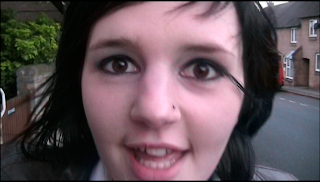
1.In the music video there are links between the lyrics and the video we produced, one of the links is that of the pieces of paper being thrown backwards, as well as the girl (Emily) singing the lyrics, for example `student`, `housewife` or `banker`. This same effect was used towards the end of the video whereby the boy in the video holds up cards saying `leader`, `hero`.
“ 2. There is a relationship between lyrics and visuals (either illustrative, amplifying, contradicting)” Andrew Goodwin writing in ‘Dancing in the Distraction Factory’ (Routledge 1992).
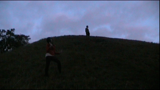
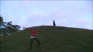
The camera angles which were used in our video, that I felt effective were; the long shot when the girl is standing halfway up the grassy hill
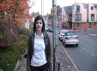
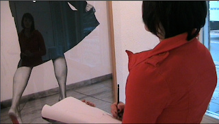
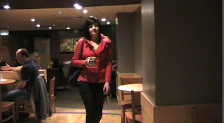
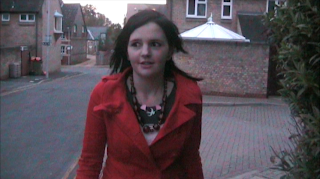
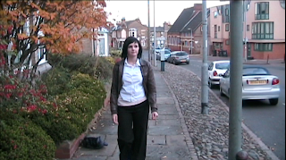
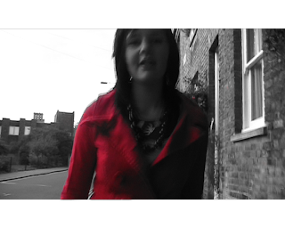
singing and dancing, whilst the boy is standing at the top of the hill. There was also a shot where the performer of our music video walks up the street singing the song, then when she reaches the word `edge` she puts her hand over the camera revealing herself wearing a new outfit which is the red jacket, the main focus of the effects in our video.
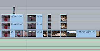
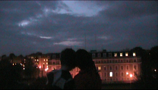
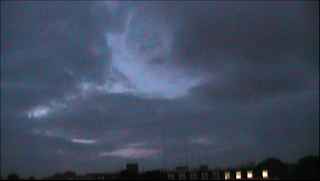
The lighting in our video was very light and bright at the start of the video, and it gradually got darker as the video continued. After filming the footage we watched it back and realised that it was too dark, and we could hardly make out the words which our performer was singing, so using the effects such as contrast and brightness on final cut, we edited this so that we could see her, and what she was singing. I also feel that at the end of the video the lighting was used effectively, as the final scene is where the girl and boy meet at the hilltop, with the background looking like a sunset I feel that this was effective because it symbolises that it is the end of their `glorious day` and the end of the song.
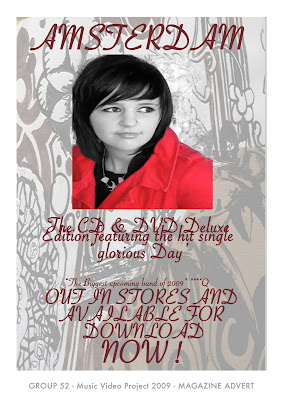
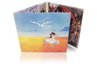
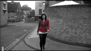
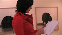
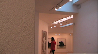
The mise-en – scene in our video was used to create the effect of our black and white with one colour, which was used the red jacket for as the one colour. The black and white effect choice came from watching pinks video to `I don’t believe you` (2009), as this video was all in black and white, the song that went with it was quite sombre, and quite different to the song that we chose, we did feel that this effect in our video may work well, even though it is a relatively up beat song. Another music video which influenced our music video was that of Bob Dylan’s `Subterranean Homesick Blues` 1965, in this video it shows a man standing in one spot holding up a series of cards with the song lyrics written on, we thought that this was a very original idea for a music video, after watching this video we felt that it might work if our performer held up cards with the lyrics of the song written on and threw them behind her as she walked. As we felt that having lots of song words written on cards would be uneffective and look unprofessional, so we thought we would try out only having 4 cards with occupations written on for the female performer to throw, and 3 cards for the male performer to throw backwards and we feel that this worked well.The black and white with one colour effect idea partly came from the video to Black eyed peas `meet me halfway` 2009, as in part of this video there is a man with everything in something similar to just black and white with his red collar standing out, and we felt this looked effective. Our digipak design relates to the digipak design of oasis, we liked the 6-panel effect, so we decided to use this. Another thing we liked about this digipak was the colour design they used, which was a beige coloured theme, and how, throughout their digipak they kept the same consistency all along with the colours.

